Coremetrix Brand Identity
For Coremetrix, my brief was to position a new specialist client-side project management business clearly and credibly for commercial landlords and property managers, then turn that positioning into qualified enquiries.
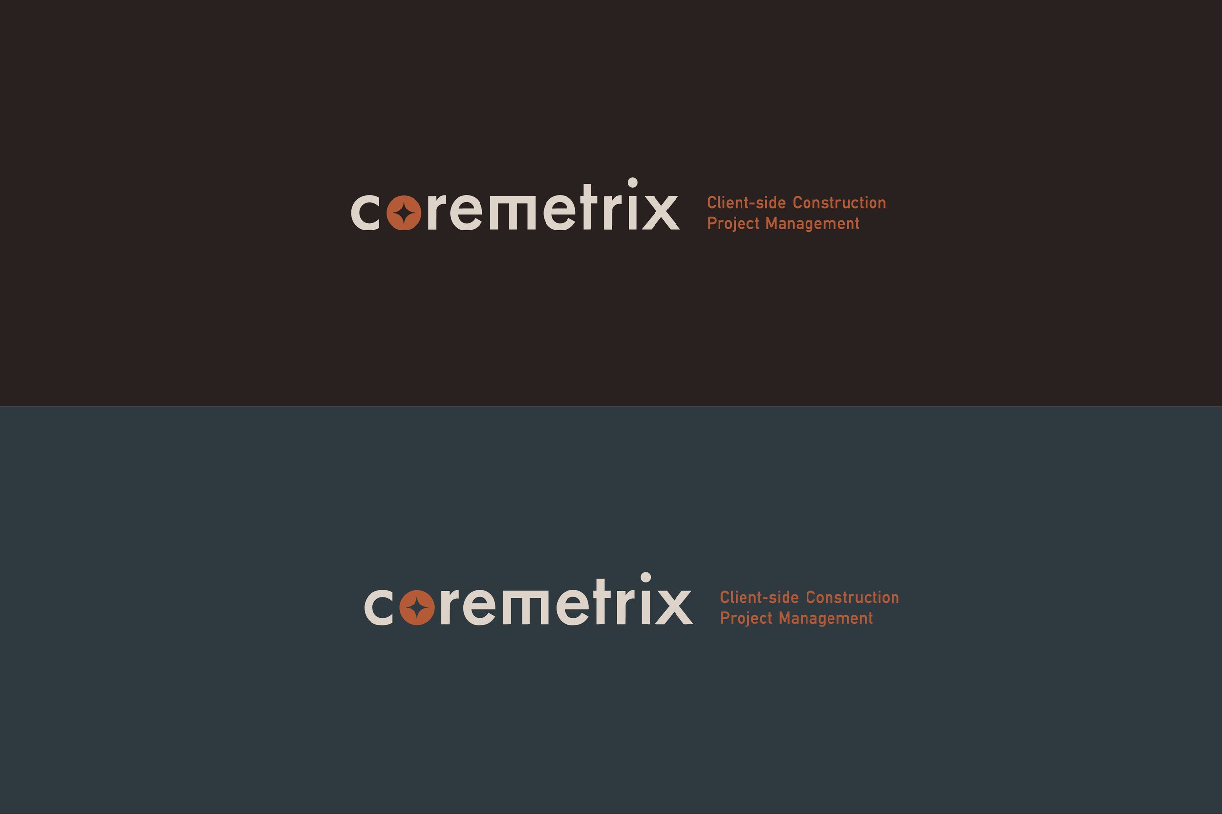
The logotype was intentionally crafted with clear, structured letterforms to convey strength, stability and confidence, qualities that are fundamental to the construction industry. Supporting this, the icon design represents the coming together of multiple elements, people and disciplines, reflecting the collaborative nature of successful construction project management. As the forms overlap and connect to create a unified central shape, the mark symbolises alignment, coordination and Coremetrix’s role in bringing every moving part together, while the negative space subtly references the head of a screw to ground the identity in construction and reinforce ideas of strength, precision and connection.
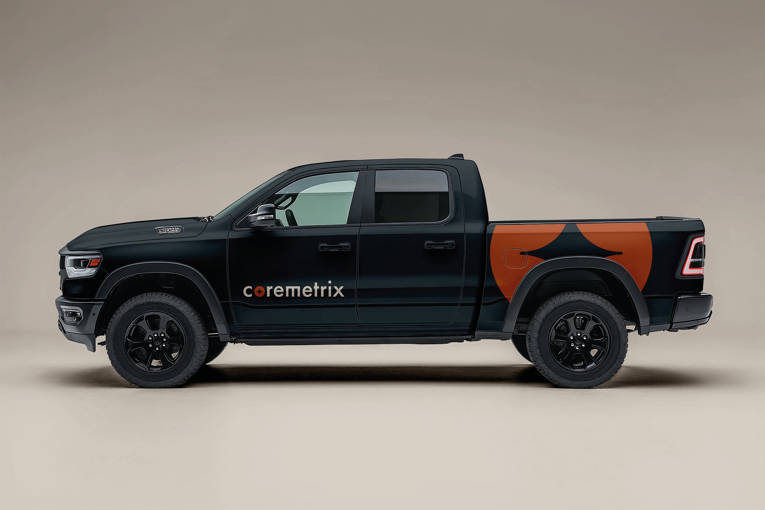
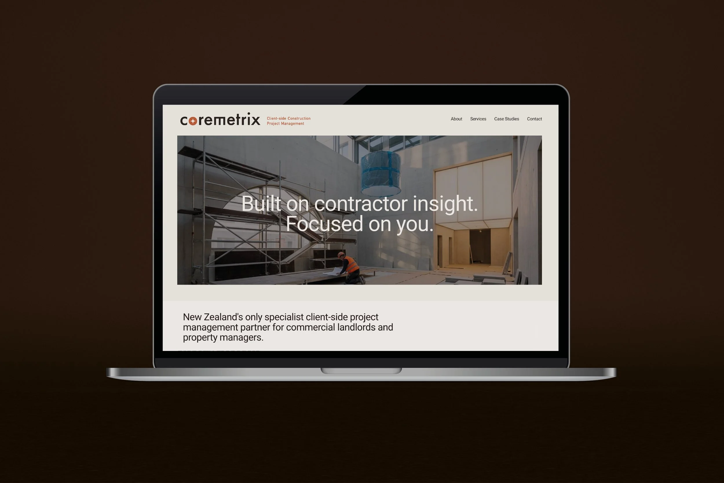
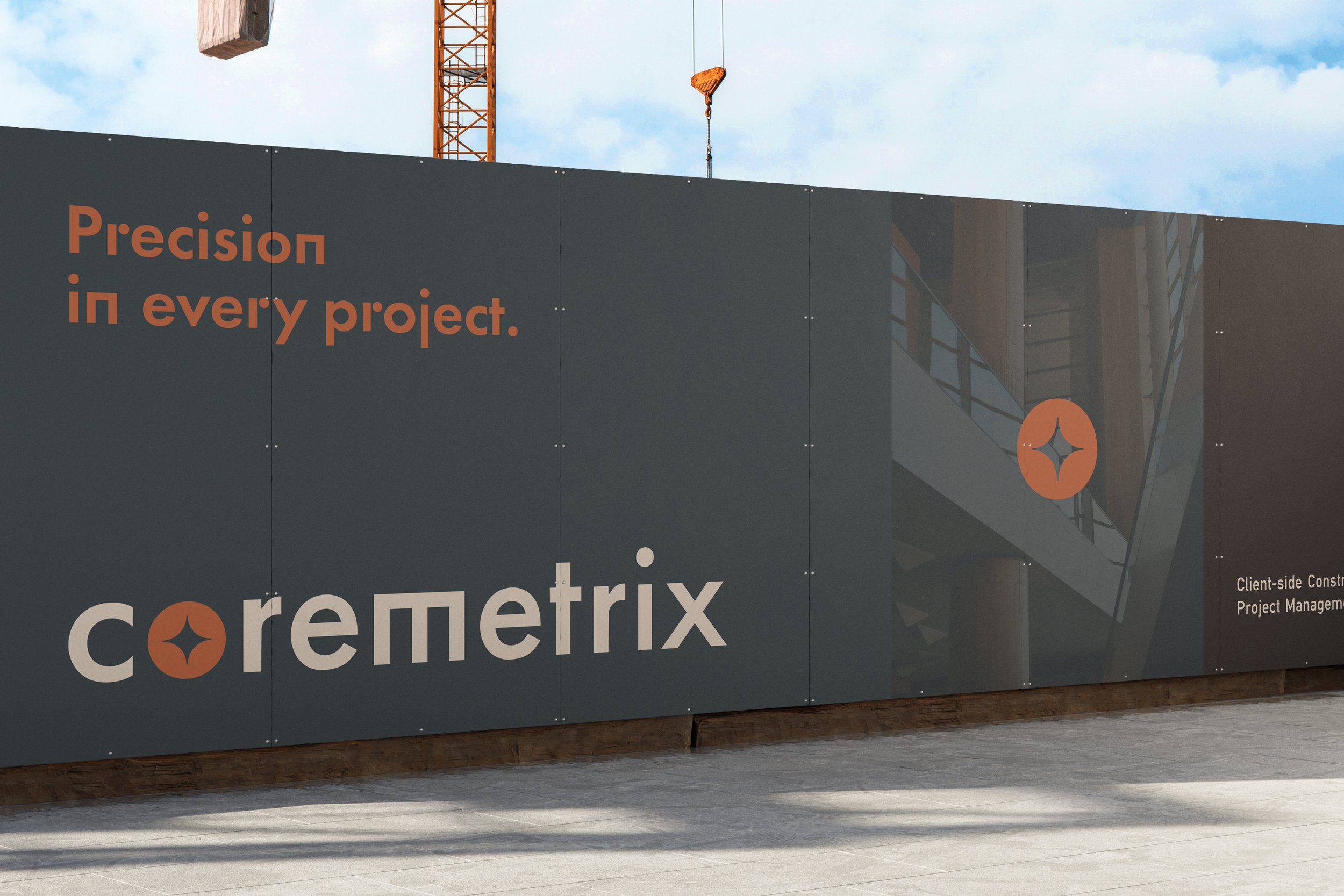
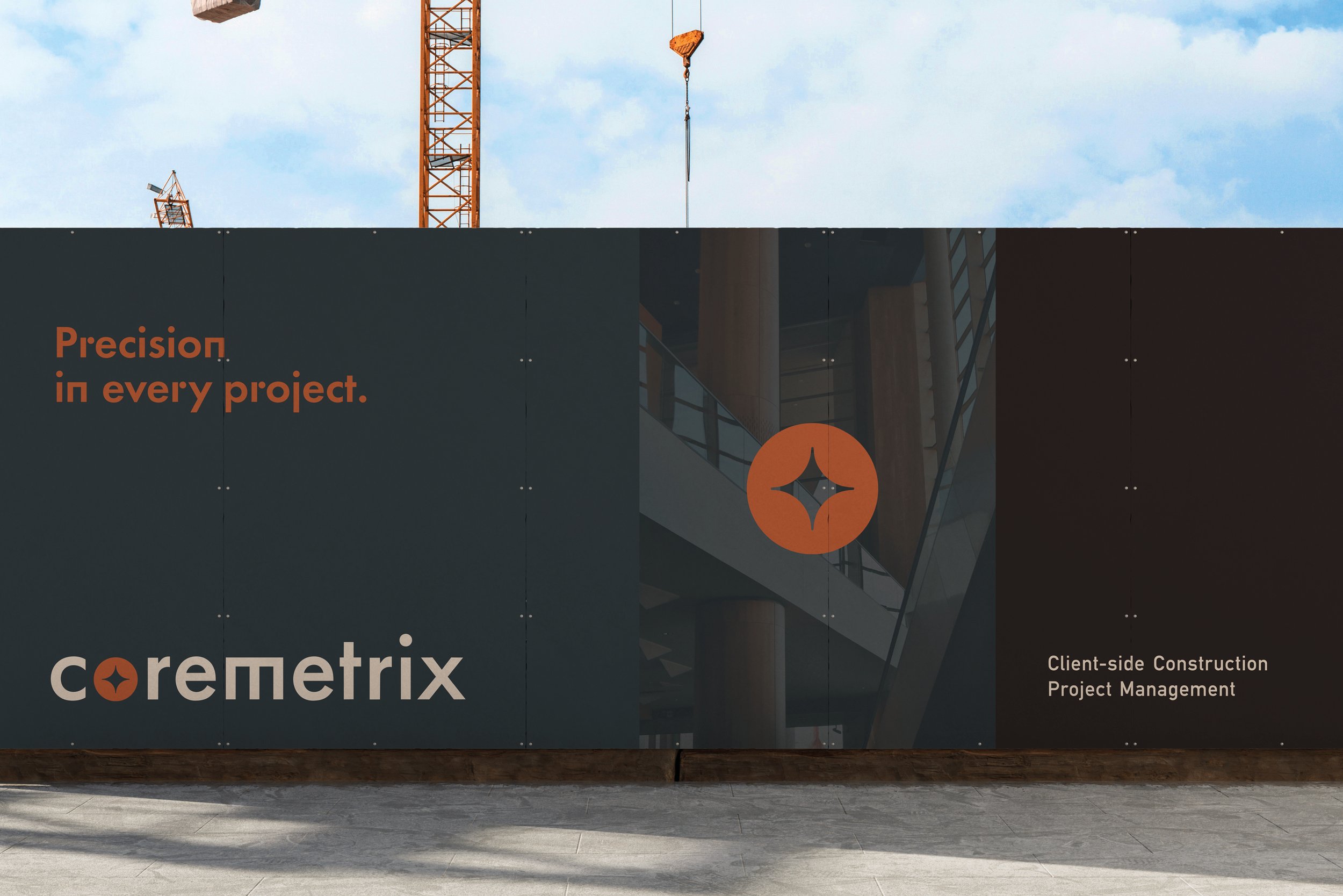
Deliverables: Brand Identity and Brand Guidelines, Hoarding, Merch & Website design