McIntosh Orchard — Brand Refresh & Packaging Design
The Brief
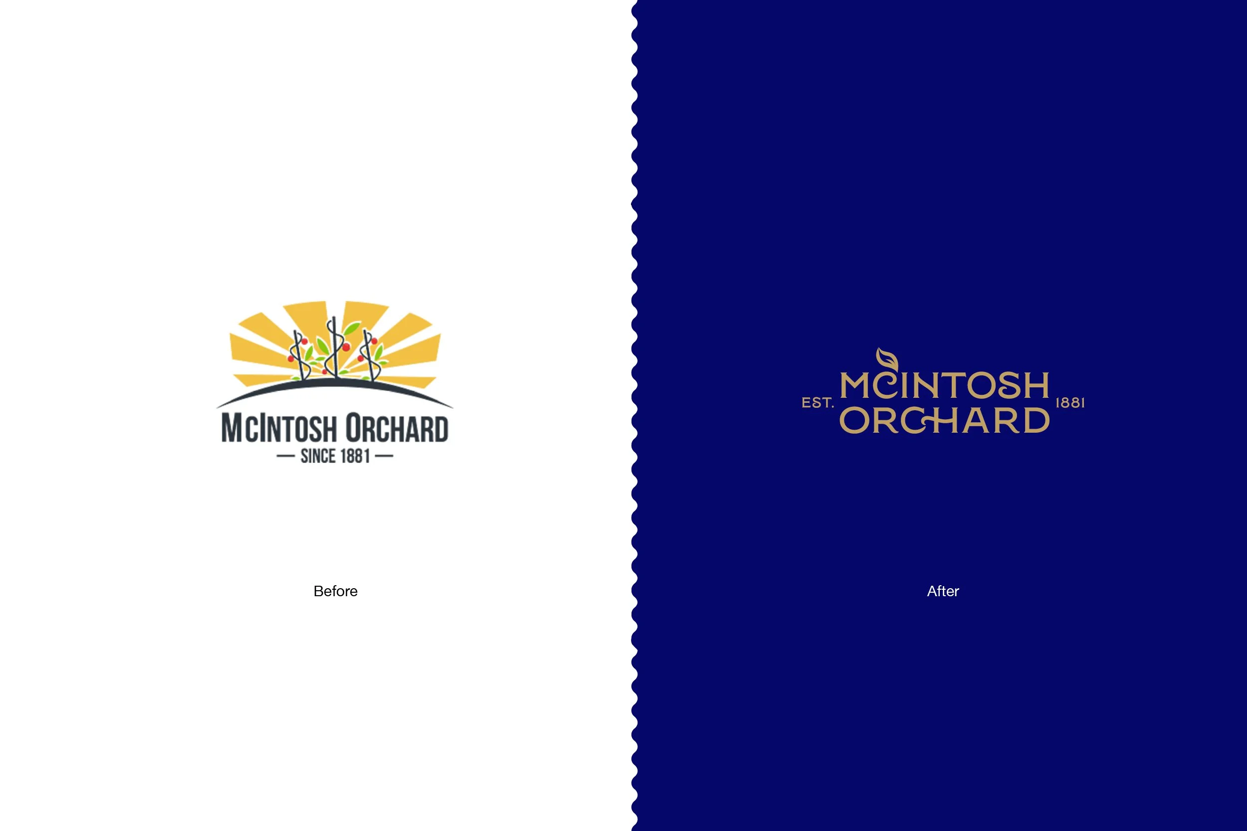
McIntosh Orchard came to me with a bigger challenge than simply refreshing the logo. The existing brand and packaging had evolved over time, resulting in a collection of fruit packs that lacked a cohesive visual identity. Each product felt somewhat separate, making it difficult to build strong brand recognition across the range.
With the upcoming cherry season approaching, there was also a genuine deadline. The brand refresh needed to happen first, giving enough time to develop and roll out a new packaging system before the new season hit. This meant creating a brand identity that wasn't just visually stronger, but was also flexible enough to work across different fruit varieties, pack formats and future applications.
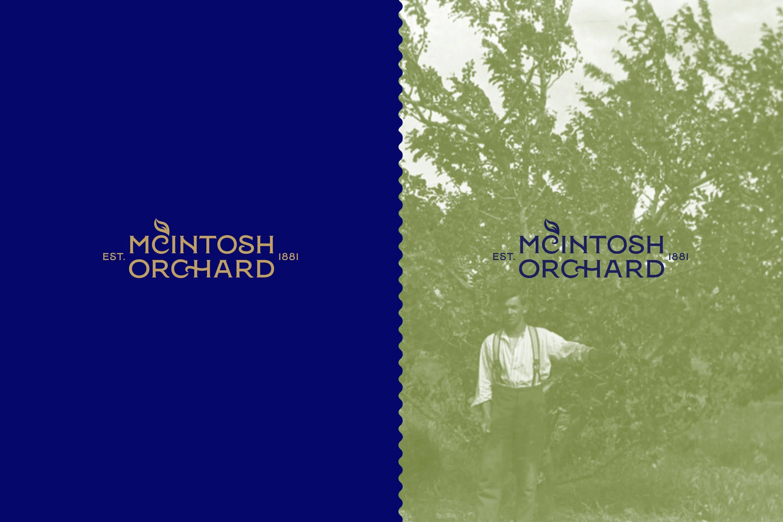
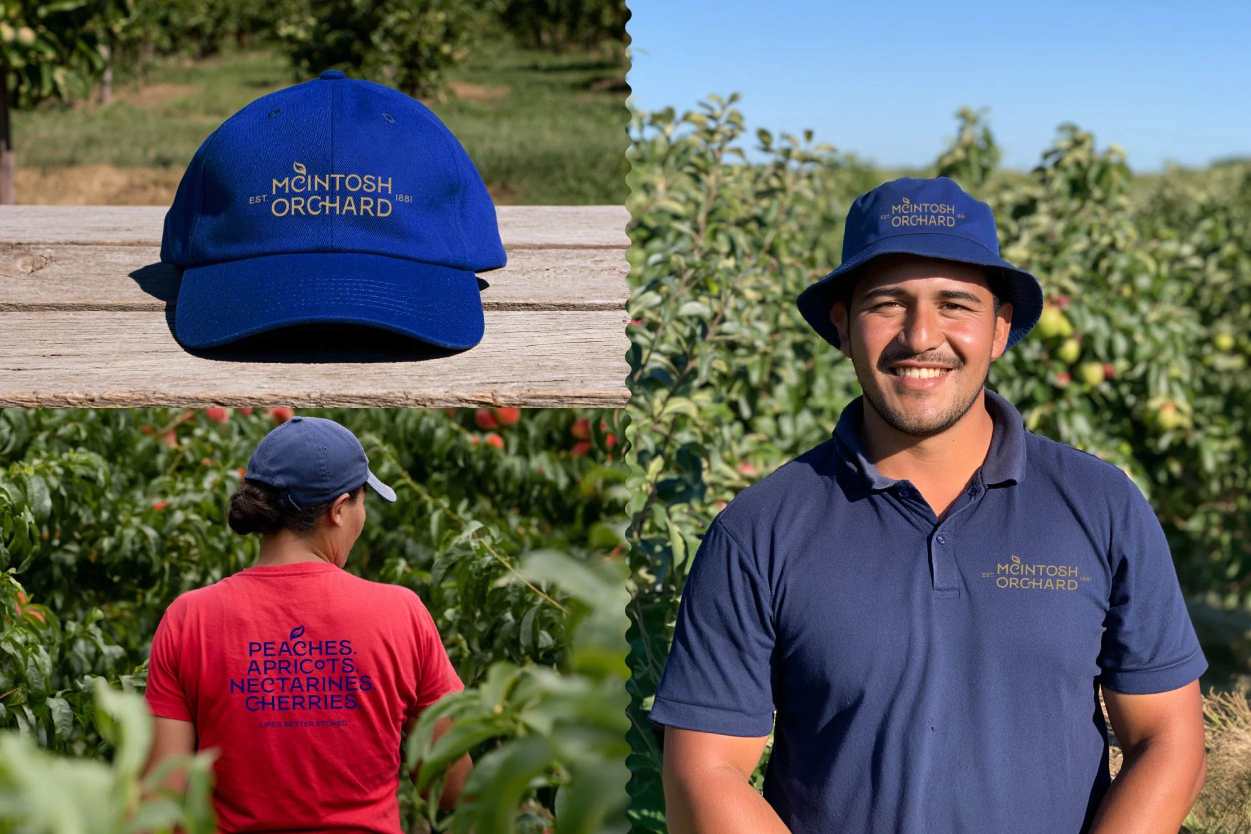
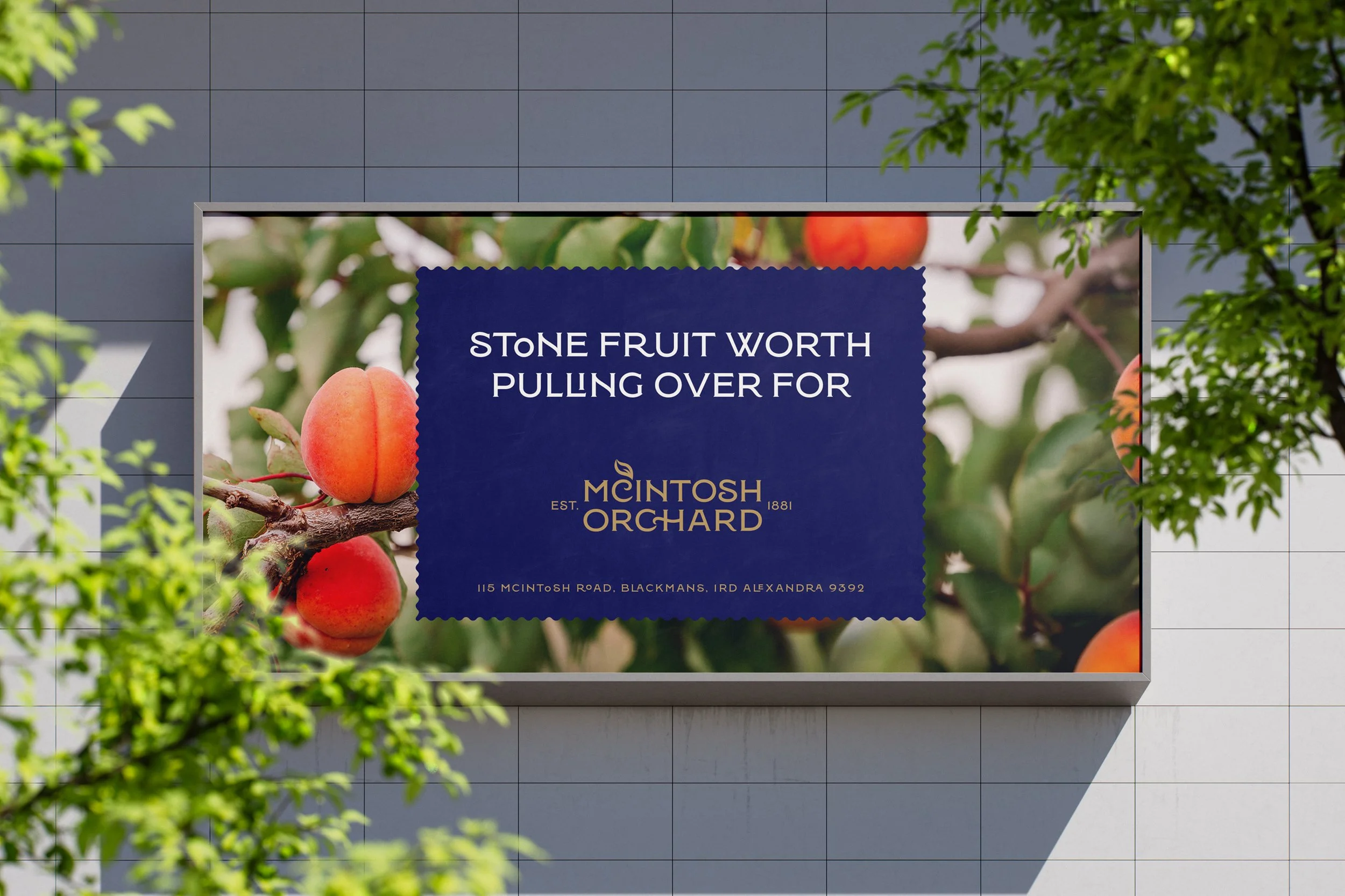
The brief was to bring together the heritage, provenance and personality of McIntosh Orchard with a more contemporary and recognisable visual identity. I wanted the refreshed brand to feel connected to its New Zealand orchard roots, while having enough flexibility to work across packaging, signage, vehicles, uniforms, merchandise, social media and digital communications.
The Design Solution
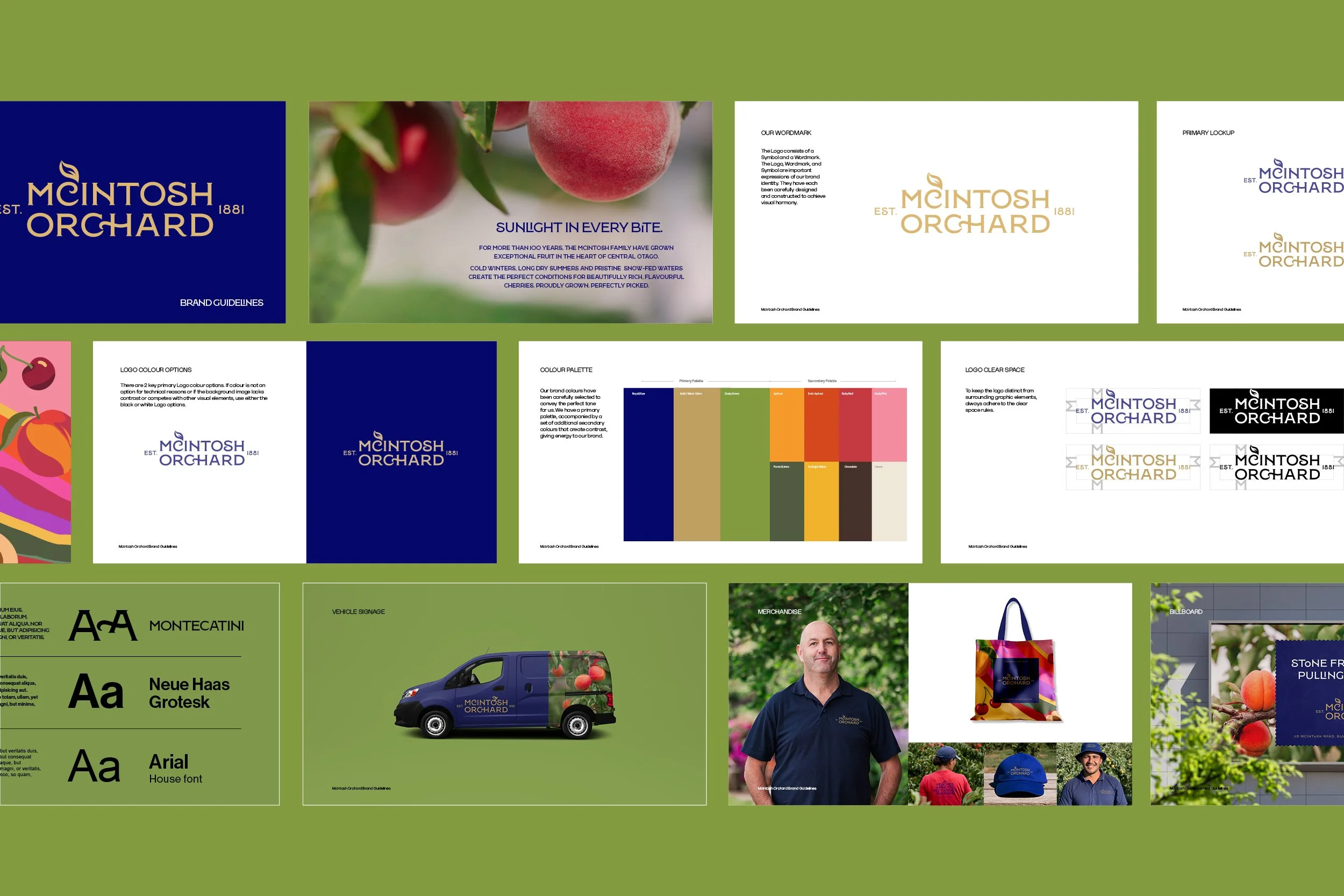
I developed a refreshed McIntosh Orchard brand identity designed to become the foundation for a completely new packaging system. Rather than treating the packaging as a series of individual designs, I approached it as a cohesive brand architecture — establishing a recognisable visual framework that could be applied consistently across the range while still allowing different fruit varieties to have their own personality.
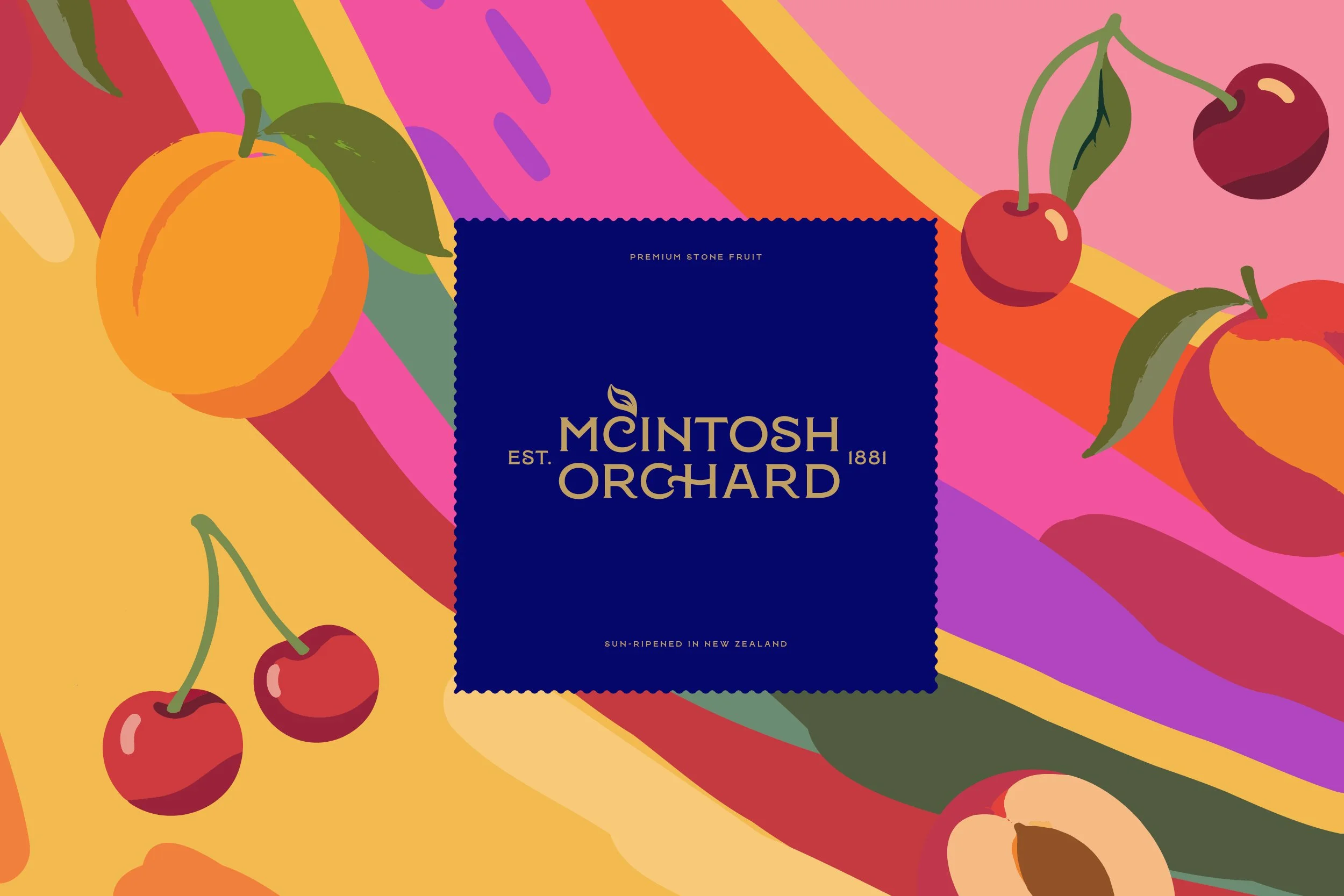
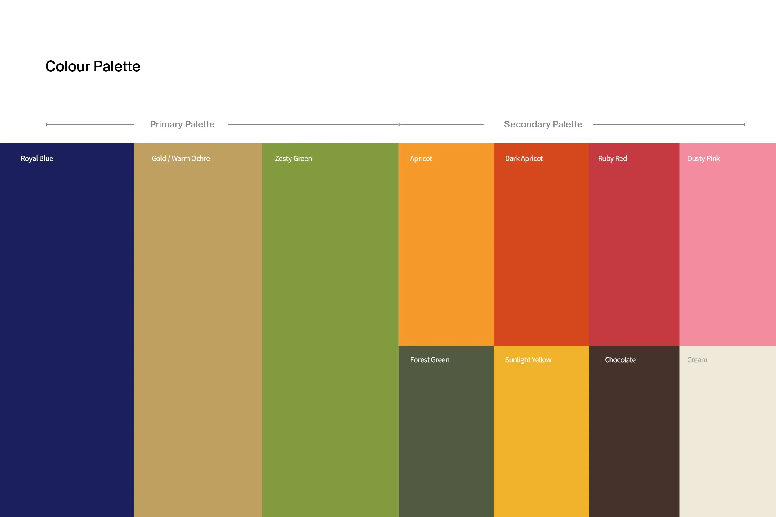
The identity combines heritage-inspired typography, an organic illustration style and an orchard-led colour palette to create a look that feels authentic to McIntosh Orchard without becoming overly traditional. The more handcrafted visual elements bring warmth and personality to the brand, while a clean supporting typeface keeps information clear and contemporary.
I also developed a more distinctive illustration language to help tell the orchard story beyond photography. The intention was for these elements to feel organic, considered and slightly handcrafted, giving the packaging a sense of provenance while creating assets that could extend into social content, store graphics and merchandise.
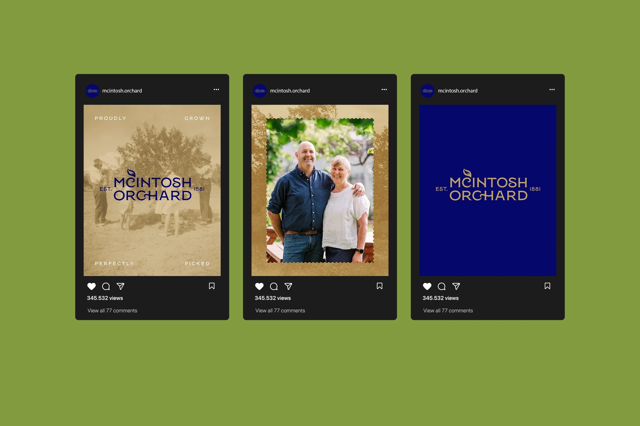
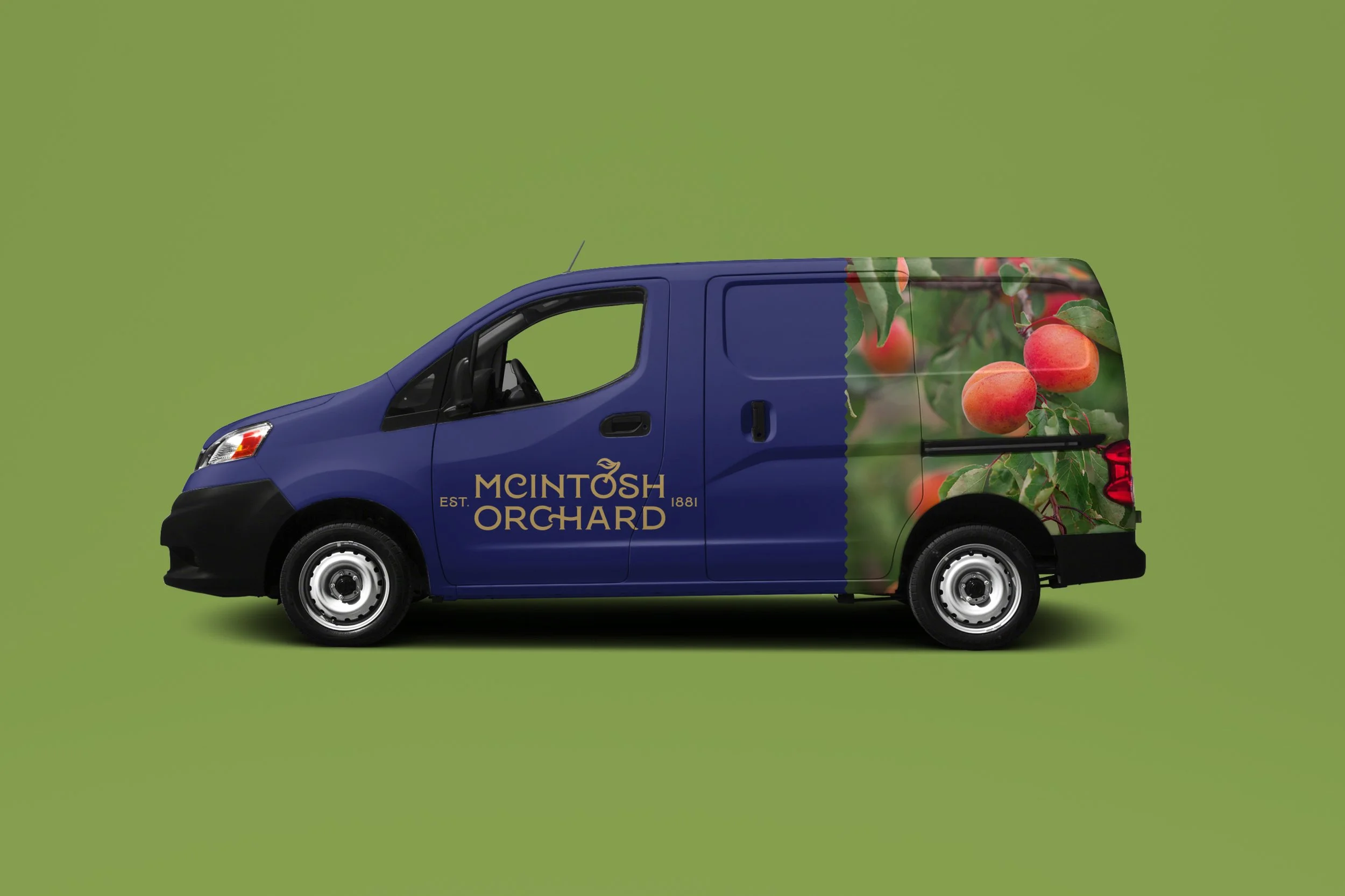
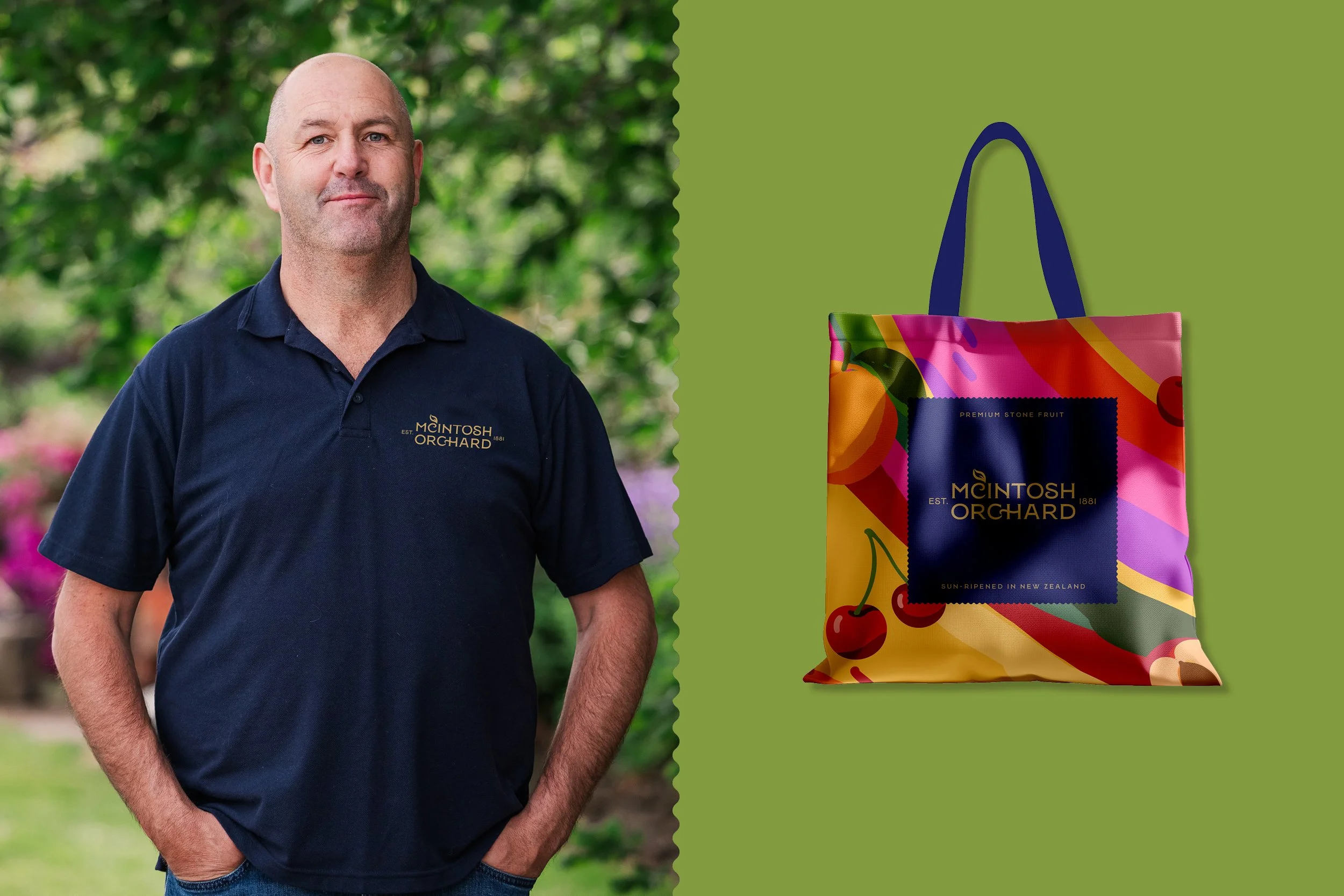
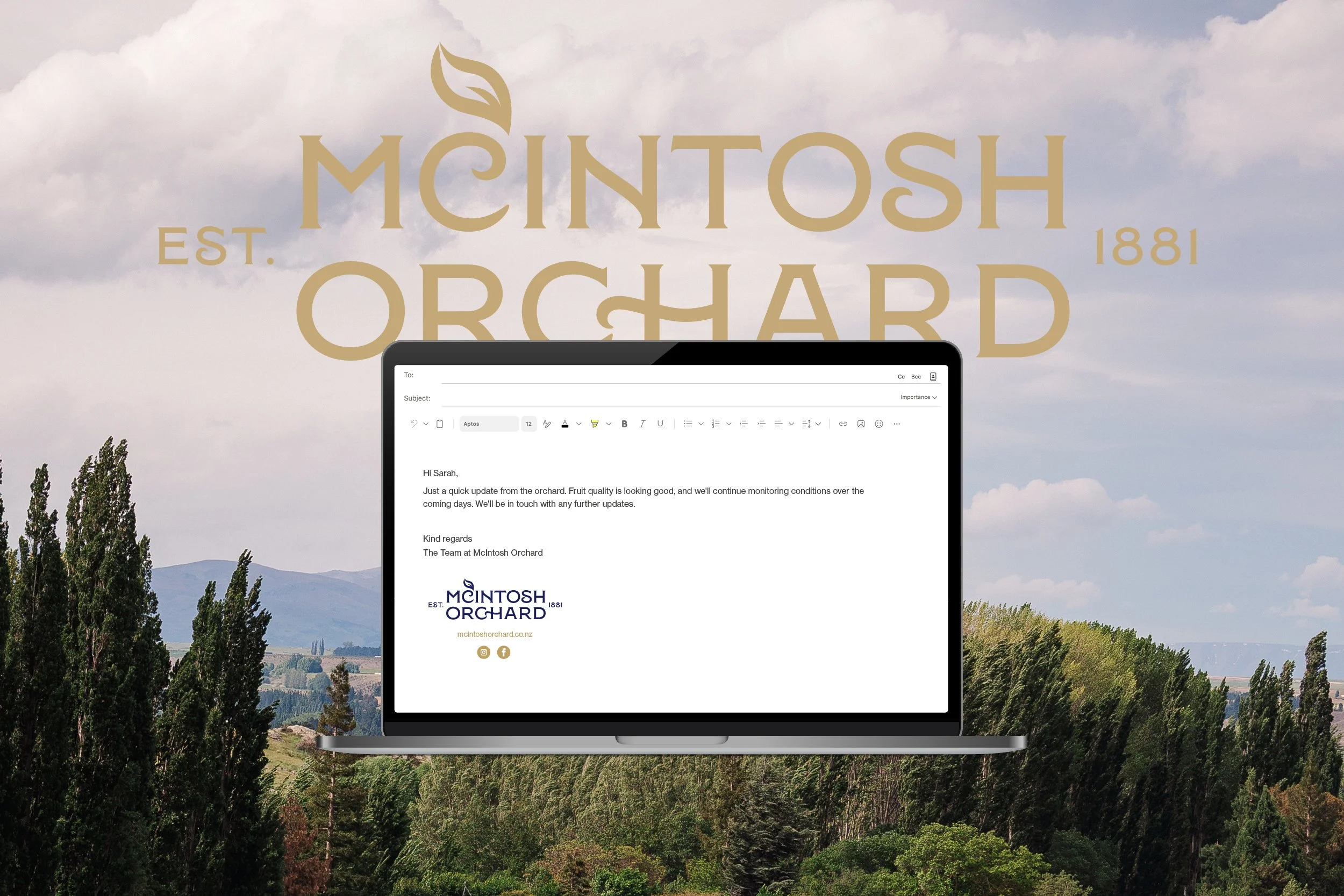
The resulting identity was then designed with packaging firmly in mind. The system needed to be simple enough to reproduce consistently across fruit packs, but distinctive enough to make McIntosh Orchard immediately recognisable on shelf. From there, the wider brand language could be applied across vehicle signage, uniforms, merchandise, email communications and other customer touchpoints.
The project created a clear visual foundation for McIntosh Orchard — bringing the brand and packaging together under one cohesive identity, while allowing the business to move quickly into its new season with a more distinctive and ownable presence.
Deliverables: Brand Identity and design system, Cherry and Stone fruit Packaging, Merchandise, Fruit Illustration, Vehicle signage, Social Tiles.