The Brief
Ports New Zealand required a complete brand identity to establish its position as a single, unified voice for the national port sector. The challenge was to create one simple, overarching brand, rather than a fragmented set of sub-identities, that could carry the credibility and strategic importance of the ports network across every touchpoint. The brief called for a mark that felt trustworthy and enduring, communicated the strategic and economic importance of the port network with clarity, and created a contemporary digital presence that balanced engineering precision with an approachable, professional feel.
The Design Solution
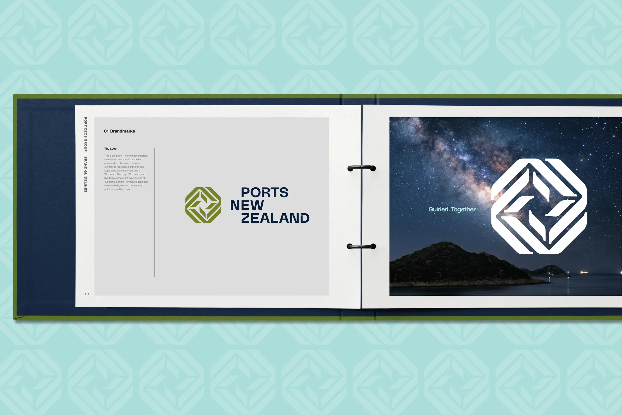
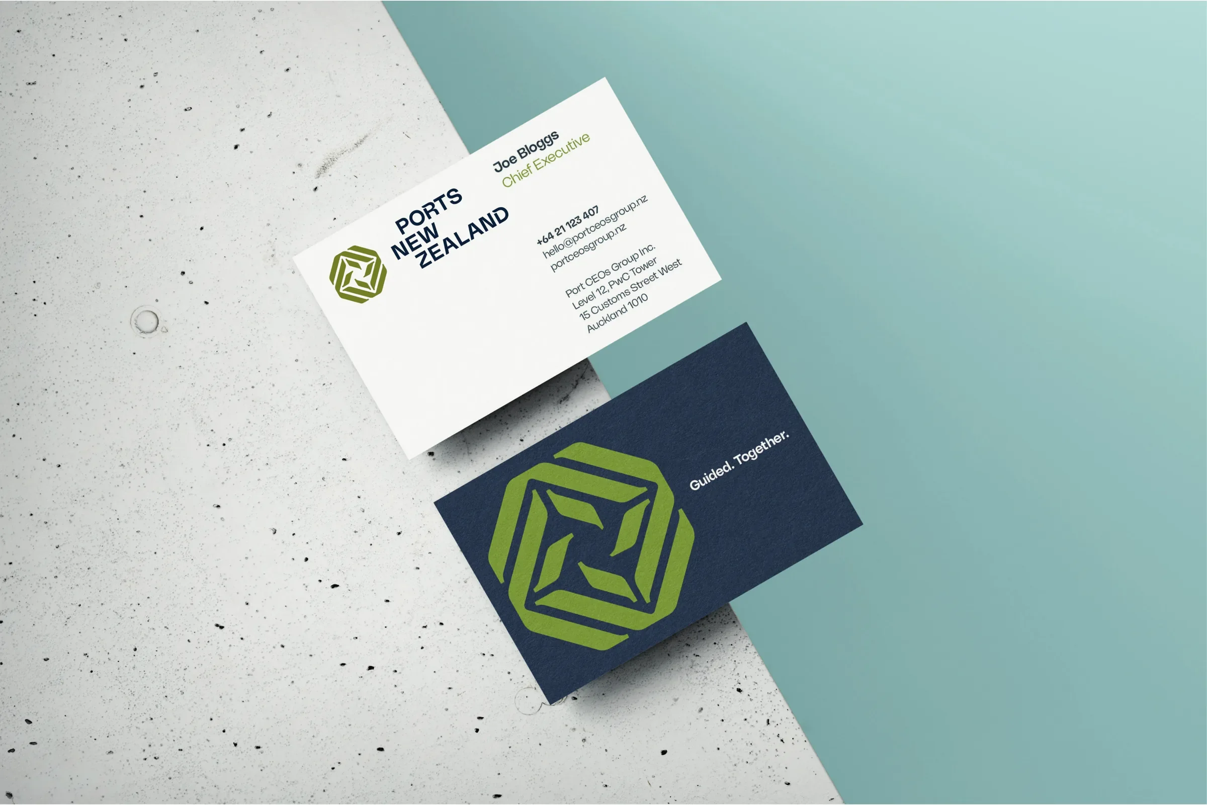
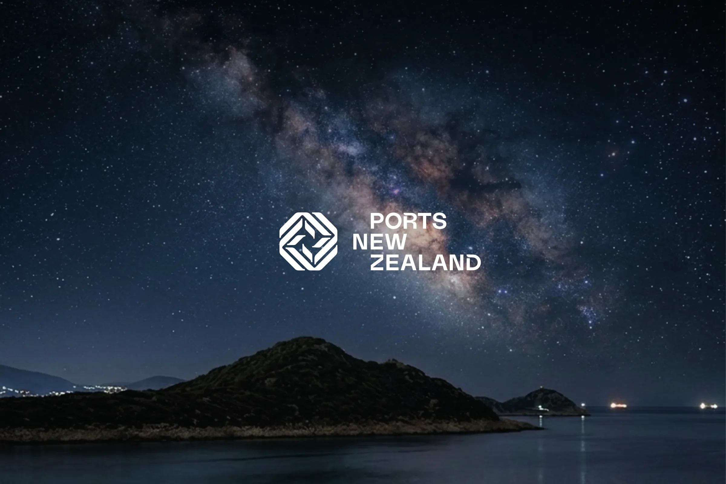
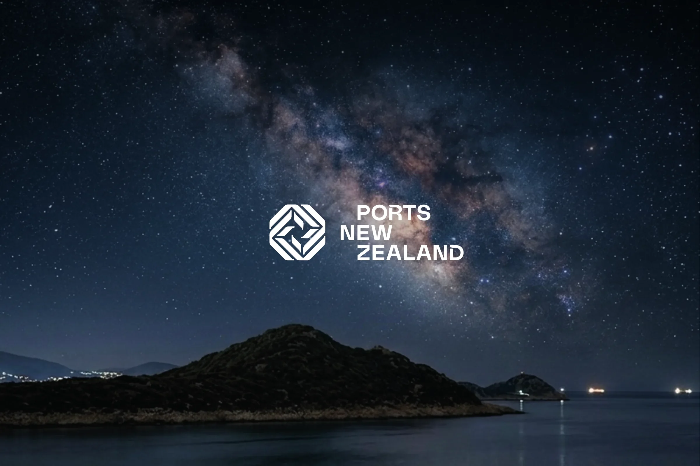
My solution centred on a single, confident identity built around the concept of a navigational star, a symbol of guidance, stability and trusted direction. Rather than building out an architecture of sub-brands, the icon brings the organisation together as one unified voice, with its geometric form expressing alignment, navigation and collective direction at its core, leadership through alignment.
A confident and crafted sans serif wordmark reinforces this with authority and credibility, while its staggered composition subtly references the rhythm, movement and constant exchange that defines the port environment. Together, the icon and wordmark form one cohesive identity that reflects a unified leadership body guiding the future of New Zealand's port sector.
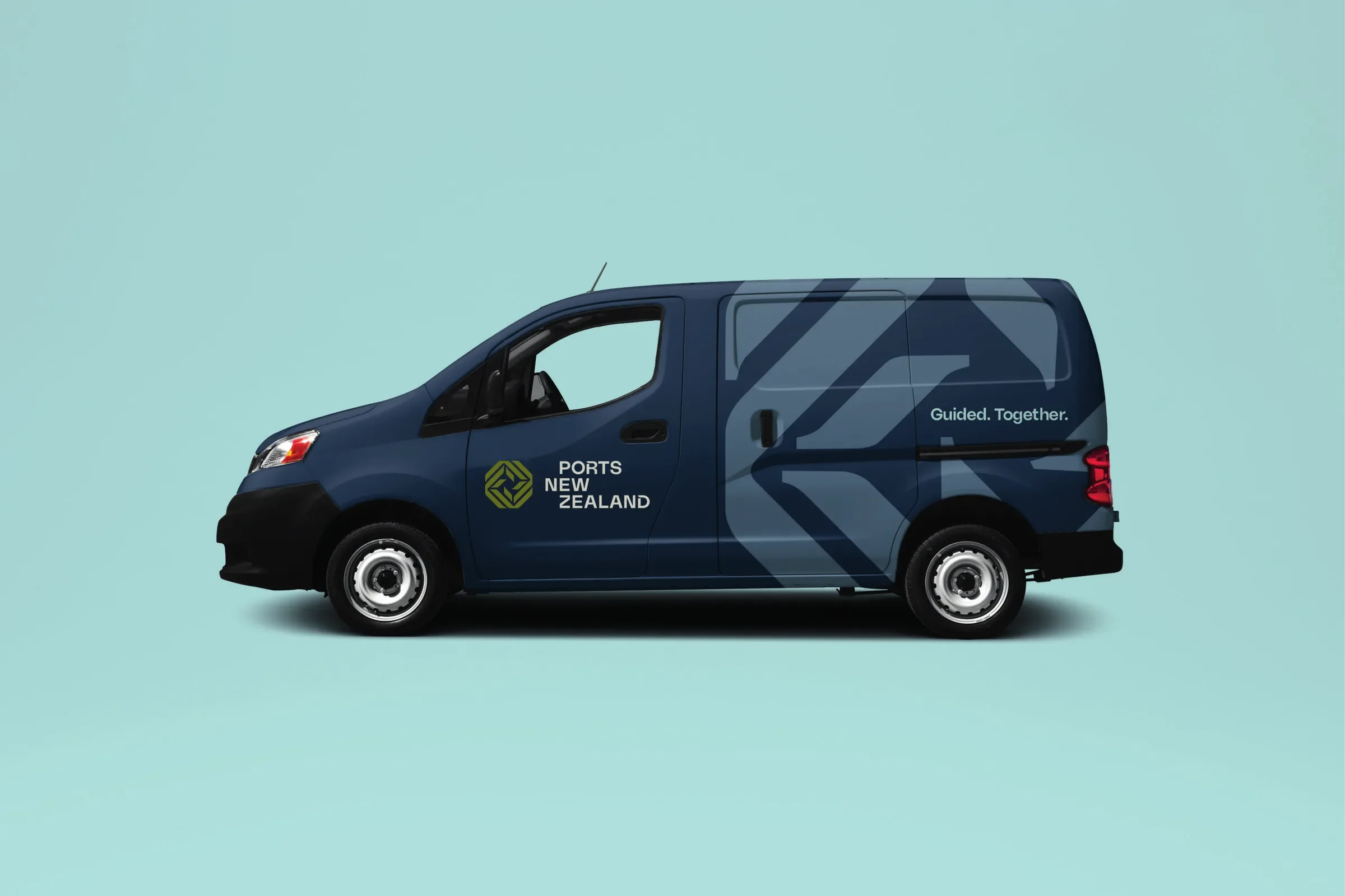
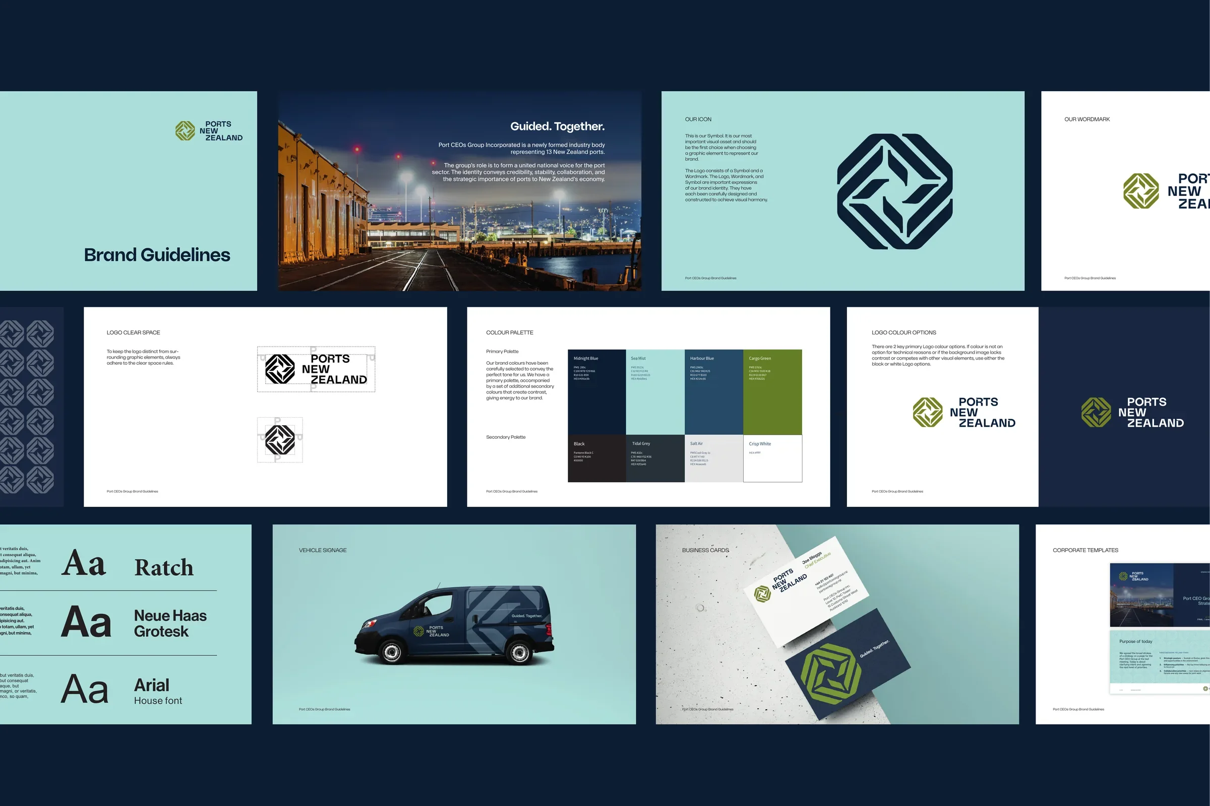
Confident typography, a purposeful colour palette and this central navigational device work together across the identity and website to make complex infrastructure information easier to navigate, and position Ports New Zealand as a single, trusted and strategically important partner to New Zealand's economy.
Deliverables: Brand Identity, Brand Guidelines, Stationery, Template Design and Email Signature
Agency Partner: Waxeye